Frock Hub
July 29, 2015
USER JOURNEY
The site is an innovative experimental online magazine with punchy
editorial headers, a dynamic, responsive grid and crisp typography.

The site is an innovative experimental online magazine with punchy
editorial headers, a dynamic, responsive grid and crisp typography.
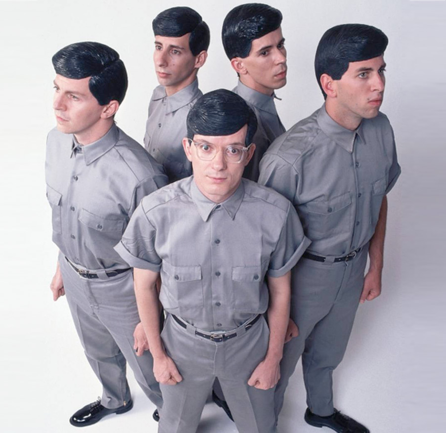
ÉS.CAPE [es-cah-paeh] (n.) An unparalleled style blog for the man and the woman. Two creative individuals
exploring their own ÉS.CAPE through fashion, art,and the world surrounding them. Inspired by experiences & aesthetics,
ÉS.CAPE captures their vibrant city through style and design. Founded by Cara Jimenez and Saxon Campbell, ÉS.CAPE features
contrasting visions of the man and the woman through understated styling with strong photography.


The site works seamlessly across tablets, mobile phones and
laptops, resizing content in real time faster than you can flip an iPad.
Playing Fashion asked us to design and build a fashion blog with an editorial feel.
The site launched in 2013 and has been updated on an almost daily basis with beautiful
features comissioned by editor and fashionista Robert Mishchenko.
Knowing they needed a redesign but having few resources themselves, the team approached Opoloo to get design and interaction on the samelevel as the development. For the task, we delineated goals to attract new users and keep the existing user base satisfied.
Although an iconic and heavily used feature of Business Calendar, the favorite bar was barely accessible: It became too small and too crowded to use as the number of calendars grew. Our solution was to use Android’s black system bar as an optical trick: The favorite bar now feels much taller and easier to tap, due to the black-in-black design. Additionally, we improved touch targets, made visible and invisible states clearer, and implemented a scrolling pattern to house more calendars.
If you’re pressed for space and clarity, using black for general interaction works well because it integrates in the system bars and lets you focus on the content, especially when the colors are defined by the user. Also, focusing on the user’s physical abilities and mindset is paramount for a good experience.
One thing we underestimated, despite intense research and good progress on the presentation side, was the hardcore user’s need to customize their calendar experience down to the tiniest detail (for example, changing the font’s transparency). Only after this initial UI exploration did we realize how much work would be needed — not only to implement the design suggestions, but also to customize everything.